
Hi there, no card to share today as i've been busy with some DT projects but I've been experimenting with my scrummy new distress markers so I thought i'd share the results with you. The full sets of markers are so difficult to get hold of but I managed to get a set at a great price from Chocolate Baroque . I've tried different types of card and used the markers direct to the stamp and to watercolour each image. Its amazing how much the type of card influences the finished result as you can see.
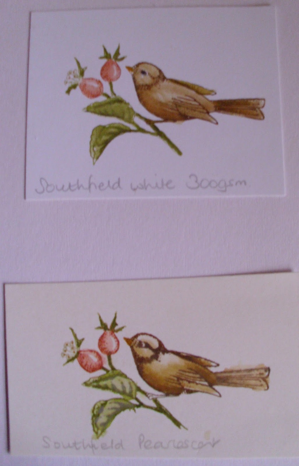

The top pic shows the image stamped and watercoloured on Southfield white 300gsm card and on Southfield pearlescent card (love this stuff its more twinkly than pearlescent - gorgeous). The bottom pic shows the results on watercolour paper and Rangers new stamping card.
I used the same colours on the stamp for each one but the finished images are so different, I'm not sure which is my favourite to be honest, I think they'll all have different uses according to the type of project. The gorgeous little birdy stamp is from Chocolate Baroque's 'Pretty Birdcage' stamp sheet.
Thanks for popping by
Claire xx

Just shows how the materials influence the finished look Claire. Thanks for sharing.
ReplyDeletehugs {brenda} xox
The difference certainly is amazing between the different cardstock Claire. The Ranger card certainly pulls the image out very sharply, especially when you have seen the others. Thanks for showing us your samples. For clarity, I'd be going for the Ranger card every time, but I do like a watercolour effect sometimes. I guess it just depends, as you say, what finish you want. Judith xx
ReplyDeleteHi Claire, nice to see how you've played with the DI markers! It's hard to choose which one....I can only say that the Ranger card looks more detailed. But they are great to work with, aren't they?
ReplyDeleteYour previous post is also a beauty, I am running behind a bit.....warm greet Mirandax
Thank you Claire for the information and photos in this post. I missed out on the set but will buy some individuals to work (pla)y with.
ReplyDeleteDebbie
I don't think you could choose one over the other as they are all beautifully coloured but it's amazing how different the results with the different card. Just wish I could colour like that in the beginning - let alone on all those surfaces.
ReplyDeleteBeryl xx
Gorgeous Claire, I love colouring and these look divine.
ReplyDeleteHugs Shirley x x
Claire,they are all beautiful. Nope I would find it hard to choose. At first I liked the top one more then it was the one below it,but then the bottom one was lovely too!
ReplyDeleteYou just done a grand job on all of them.
They are all really beautifully coloured, but ivthink the one on pesrlescent just does it for me. Thanks for sharing this.
ReplyDeleteWanda
Thanks for sharing the resultsd of your experiments - very helpful and the difference is noticeable. Shows it is worth trying different things when time allows.
ReplyDelete